Balance
2 Week Sprint. Concept Brief. Team of 4.
Bioinformatics Exploration for Meditation App ‘Balance’
User interviews: 15
Usability testing: 8
Methodology: Double Diamond
Skills used: Research, competitive and comparative analysis, user interviews, low, mid & hi-fidelity design, UI design, prototyping, usability testing, information architecture, site mapping.
Tools used:
Overview
The Client
Balance is a meditation app that specialises in tailoring meditation programmes to its users. They experienced their most substantial customer growth during the pandemic, largely due to offering a year-long free trial for new users.
The Problem
Balance is currently experiencing a decline in user subscriptions following a year-long free trial. They believe that new meditators often find meditation challenging and frustrating due to frequent distractions, making it difficult to establish a consistent habit. Additionally, Balance recognises that meditators struggle to gauge their progress since there is currently no tangible way to track it within the Balance app.
As a result, Balance is exploring a potential partnership with Muse, a company known for creating wearable brain-sensing headbands equipped with EEG sensors that can alert users when their minds wander. This collaboration aims to enhance users' meditation experiences. Before proposing this partnership to Muse, Balance is conducting market research to better understand the opportunities in this space.
My Role
This project was a collaboration involving three other UX/UI designers. My distinct contributions included:
User research coordinator.
Project timeline management.
Conducting competitive and comparative analyses.
Crafting sketches and wireframes.
Conducting user interviews and usability tests.
Taking the lead during the 'Define' phase in our final presentation.
The Solution
User interviews: 15
Design iterations: 2
Usability tests: 8
Integrated metrics from the Muse headband into the Balance app:
Enhanced existing components within the Balance app, such as the post-meditation report, to display immediate feedback from the Muse band, including heart rate reduction.
Introduced extra screens enabling users to access their Muse metrics and monitor their progress. These screens were divided into four sections, each dedicated to a distinct measurement: brain waves, posture detection, breath detection, and heart rate.
Ensured prominent visibility of the new Muse feature within the app without detracting from the established Balance branding.
The Impact
Previously, users could gauge the positive impact of meditation solely based on how it affected their mental well-being. However, tracking this progress was often challenging, leading to a loss of motivation as users couldn't see concrete results, particularly when starting their meditation journey. Consequently, many struggled to form a consistent meditation habit using the Balance app.
With the seamless integration of Muse headband features into the Balance app, our user tests revealed that users found immediate feedback highly motivating, offering them a tangible sense of accomplishment.
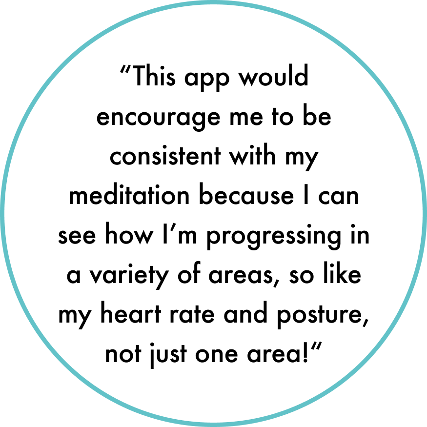
Now, users can easily monitor their progress within the app through the Muse band metric screens and receive instant feedback after meditation sessions. This encourages continued use of the Balance app by providing a measurable sense of advancement, helping users establish a lasting meditation routine.
Moreover, for newcomers to meditation, the app now showcases the physical health benefits, offering quick, tangible improvements rather than waiting for the longer-term mental health benefits to manifest.
While incorporating elements of Muse branding, we've enhanced the design of the Balance app while maintaining its calming and consistent brand personality.
Full Case Study
The Problem
Balance is currently experiencing a decline in user subscriptions following a year-long free trial. They believe that new meditators often find meditation challenging and frustrating due to frequent distractions, making it difficult to establish a consistent habit. Additionally, Balance recognises that meditators struggle to gauge their progress since there is currently no tangible way to track it within the Balance app.
As a result, Balance is exploring a potential partnership with Muse, a company known for creating wearable brain-sensing headbands equipped with EEG sensors that can alert users when their minds wander. This collaboration aims to enhance users' meditation experiences. Before proposing this partnership to Muse, Balance is conducting market research to better understand the opportunities in this space.
Who is Balance?
Balance, a meditation application, provides tailored meditation programs to its users. The majority of their customer base was obtained during the pandemic when they introduced a one-year free trial for new users.
Objectives
Understand the key pain points hindering meditators' engagement, including the factors that prevent them from building a long-term meditation habit.
Gain insights into the motivations behind users initially downloading the app.
Explore the potential of using bioinformatics and data from EEG headbands to increase user engagement and retention.
Develop visual solutions to effectively display data from EEG headbands in a meaningful way.
By focusing on these objectives, Balance can gain a better understanding of user needs and challenges, explore innovative ways to enhance the meditation experience, and establish potential partnerships to further improve the app's offerings.
Discover
Competitive & Comparative Research
During the initial phase of our discovery process, we conducted competitor and comparative research to gain insights into the current meditation app market. As many of us were unfamiliar with the Balance app, we dedicated time to explore its features and offerings. Subsequently, we conducted a feature inventory to compare the Balance app with direct competitors like Headspace, Mindfulness, and Calm. This allowed us to assess the unique features and strengths of each app within the competitive landscape.
Upon reviewing the feature inventory, we observed that the meditation apps exhibited similar features, indicating limited research potential in this market. As a result, we conducted an Element Analysis, which revealed several key elements for consideration. These elements included:
The incorporation of consistent progress reports, providing updates on the app's positive impact on users' physical and mental well-being.
Gamification inspired by platforms like Duolingo to encourage continued engagement and learning.
Implementing a scoring system to track user interactions.
These findings highlighted the importance of incorporating incentives within the app to enhance user engagement and retention.
User Research
As a team, we conducted 15 user interviews with individuals aged between 23 and 40, specifically targeting those who have engaged in meditation within the past 2 years. These interviews provided valuable insights from individuals with prior or ongoing experience in meditation.
I asked indirect, open ended questions to find out:
The key pain points hindering mediators engagement and long term meditation habits.
Why users initially downloaded the app (motivators).
If providing users with metrics and data from headbands would encourage engagement and use of the app.
To efficiently analyse the interview data and spot recurring patterns, I employed an affinity map (see image below). Despite the large volume of insights, I set a dedicated time limit for this task. Nevertheless, the affinity map proved highly valuable, quickly revealing crucial patterns and key findings, which aided our confident transition to the Define stage.
Affinity Map
3 key trends were identified from user interviews:
Motivation: Users don't feel motivated to meditate regularly.
“I find it hard to form new habits, I usually need to work towards a goal to stay motivated”
“I didn’t feel like I was getting anything out of meditation, so I just stopped doing it”
Habit: Users struggle to develop and maintain a meditation habit.
“If I could have seen some kind of improvement I might have carried on using the app”
“It’s so important to track my progress and see achievement, or I don’t feel like there is a point in continuing”
Value: Users don’t see the monetary value in paying for a mediation app.
“The paywall made me stop using the app”
“I don’t see the point in paying for an app to meditate, I can just do my own meditation, there’s nothing the app gives me that I can’t do by myself”
Define
Persona
In the define phase, we identified our target users and understood their needs and frustrations. To guide our solution development, we created a persona named Jenna - a busy 32-year-old working full time in a fast-paced corporate environment. Jenna represents our target user who seeks guidance in establishing a meditation habit. Her persona allowed us to empathise with her challenges and design a solution tailored to meet her specific needs.
Persona
Problem Statement
After considering our user persona, we honed in on our problem statement. While we acknowledged users' concerns about the meditation app's perceived value compared to its subscription cost, we chose to prioritise the most significant issue related to tracking measurable progress.
‘Jenna needs to establish a consistent and long-term habit to effectively reduce her stress level after work. However, she lacks motivation to meditate, and feels frustrated by the lack of progress and measurable achievements’
User Journey & Flow
We carried out a user journey to identify the current user pain points:
User Journey
We can see Jenna's journey starts positively with her meditation practice. Nevertheless, her inability to track progress eventually leads to a decline in motivation, contributing to a negative user experience.
We also addressed this problem within a user flow, emphasising at different stages that Jenna lacks a means to track her concrete achievements. This absence of motivation for her to repeat her actions increases the likelihood of Jenna abandoning her meditation habit.
User Flow
How Might We Statement
Reflecting on our user flow and journey, as well as our problem statement, we produced our how might we statement:
“How might we provide Jenna with the motivation to establish a consistent, long-term meditation habit”.
Solution Statement
“Jenna needs a way to view tangible achievement and progress updates to give her the motivation to form a consistent meditation habit”
With this solution statement in hand, we will proceed to the development phase, using it as our guiding framework.
Develop
Design Studio
With our ideas and user flow in place, we were set to begin low-fidelity sketching. We held a collaborative design studio session over Zoom, combining our main "How Might We" statement and research insights. We generated numerous ideas and defined app features, user flow, and wireframes to address Jenna's problem.
We conducted two rounds of 5-minute sketching. In the first round, we noticed similar ideas such as:
Connecting feature for the Muse band
Progress tracking
However, the results were limited. So, we proceeded with a more fruitful second round.
First round, low-fidelity sketches
During the second round, we identified key pages and features to include in our mid-fidelity wireframes.
Common themes emerged, such as:
The Muse headband feature on the navigation bar
Brief details with a three-step guide
Symbol for navigation bar connectivity.
Progress tracking and metrics
We shared our sketches and selected the preferred features from each to develop the mid-fidelity design.
Second round, low-fidelity sketches
Mid-fidelity Wireframes
We jumped right into Figma to start bringing our design to life. With the existing Balance app as our reference point, we focused on maintaining the current display and usability of the balance app while adding in additional features.
Added an additional icon in the navigation bar to provide easy access to the Muse headband screen within the app.
We introduced an option for "Visual Focus" during meditation, merging the audio capabilities of the Muse headband with the visual elements found within the Balance app.
We implemented a "Calm %" screen and a "Heart Rate Report" at the conclusion of each meditation session. These features provide users with immediate insights into the impact of their meditation session.
We introduced a dedicated tab that allows users to access their Muse metric reports. Within this tab, users can access various screens to view different reports, such as brain activity and heart rate data.
Mid-fi Usability Testing
We conducted user tests to evaluate our mid-fi wireframes before proceeding to our high-fidelity designs. We prepared a research guide in advance to guide us during the individual user testing sessions.
Following our individual user tests, we reconvened as a group to consolidate our findings. During the usability testing, we collected both quantitative and qualitative data to gain comprehensive insights into the user experience.
Quantitatively, users rated specific tasks on a scale from 1 to 10, where 1 indicated ease and 10 indicated difficulty. Here are the task ratings:
Navigating Muse metrics: 2/10
Connecting the Muse band: 1.25/10
Understanding the data presented in the Muse metrics: 2.8/10
100% of users successfully completed these tasks, reflecting a promising usability aspect.
Qualitatively, we observed several noteworthy points:
Users found the immediate feedback motivating, giving them an instant sense of achievement.
Users appreciated the seamless connectivity of the Muse headband.
Users saw the metrics as an incentive to practice regular meditation because they could see the physical benefits
Constructive feedback:
Users could not identify Muse was a new feature
“I can navigate to the Muse screens but I wouldn’t have instinctively looked at the screens without being asked to”
“I like the metics but I didn’t realise this was a new additional feature to the app”
Users wanted an indication that the Muse headband was connected when they had left the Muse screen
“I can easily find the Muse screen to connect the band, but I’m not sure how to check the band is connected once I have left this screen?”
“I would like to be able to check if my band is connected or not when I begin my meditation”
Users were unsure as to what the ‘65bpm’ metric referred to
“I wasn’t sure what the BPM number was referring to - is this an average of my heart rate during the session? Or what I finished on?”
“Does the BPM show me what I started on or what I finished on?”
Colour & Typography
Moving on to our high-fidelity wireframes, we started by focusing on the colour and typography of our design.
We were impressed with the typography used in the Balance app due to its clarity and simplicity, which strongly resonated with the brand message. Consequently, we opted for the "Inter" typeface as it closely resembled the current typeface in Balance.
Regarding the colour palette, we admired the serene and calming colours employed in the Balance app, which coincidentally aligned with the secondary and accent colours of Muse. This prompted us to combine these colours to showcase a collaborative connection between the two brands. Additionally, we utilised some of the brighter primary colours from the Muse colour palette to highlight icons and metrics within our app.
To capture the essence of this colour collaboration, we created a mood board that showcased the visual harmony between the two brands. Furthermore, since the Muse headband produces sounds like wind or rain during meditation, we incorporated cloud visuals into the app to further emphasise the collaboration between the Muse headband and the Balance app.
Deliver
Revisiting the issue
Jenna needs to establish a consistent and long term meditation habit to effectively reduce her stress levels. However, she lacks motivation to meditate, and feels frustrated by the lack of progress and measurable achievements.
High-fidelity Testing
After finalising the high-fidelity prototype's design, we embarked on testing several new features integrated into the Balance app.
Our first focus was determining the optimal colour for the 'connected' display on the headband. Our goal was to visually indicate when the Muse band was successfully connected to the app. As a team, we dedicated considerable time to this decision-making process. Initially, we considered using a green colour or incorporating a green drop shadow, but after conducting accessibility tests, we found that this choice did not meet our standards.
Ultimately, I came up with the blue drop shadow to signify the successful connection of the headband. Subsequently, 100% of users tested confirmed that this approach effectively communicated the connection status to the user.
Test designs:
Selected design:
Furthermore, in response to feedback received during our mid-fidelity user tests, we introduced coach marks to specific screens within the app. These coach marks served as visual cues to inform users about the introduction of Muse as a new feature. Subsequent user testing outcomes demonstrated a remarkable 100% recognition rate among users, validating the effectiveness of these coach marks in conveying the novelty of Muse within the app.
Next Steps
Following our usability testing of the colour palette, we found that the current blue and grey colours used in the Balance app are not perceived as user-friendly. To address this, we recommend adjusting the saturation of these colours and conducting additional user tests to gather feedback and determine the optimal modifications.
Additionally, our research revealed that users were uncertain about the meaning of "singles" when navigating to a meditation session. To enhance clarity and user understanding, we propose conducting further competitive research within the same app category to explore naming conventions used by other apps. By aligning with users' preferences for intuitiveness, we can identify the most suitable name for our category app, ensuring a seamless and user-friendly experience.
Furthermore, we seek to explore whether users would actually utilise the eyes shut feature. Understanding users' preferences and habits in relation to this practice would provide valuable insights for shaping the offerings of the app.
Key Learnings
Group Work Challenges: I learned that working in a team doesn't automatically reduce the workload or simplify tasks. Dealing with varying experience levels and the need to reach a consensus can make group work more challenging.
The Importance of Communication: I learned that effective communication is vital for overcoming group work challenges. I found that regular updates, clear discussions, and open communication channels are essential for a successful team effort.
Check out my other projects!
