Redesigning Parkinson’s UK Local Support Group tool to enhance accessibility and usability, making it easier for users to find local groups, events, and support resources.
My Role: Associate UX/UI Designer
Published: 2025
Team: Associate UX Designer (myself), Senior UX Designer (left halfway), Product Managers, User Researcher
Tools Used:
Overview (approx 5 minute read)
The Goal
To redesign the Local Support Tool, improving its accessibility and usability to help users easily find local support groups, activities, and advisers, while also supporting new virtual online activities.
The Impact
Seeing my UX project go live — and featured on BBC Morning Live — is a proud moment!
The Local Support Tool helps people with Parkinson’s find nearby support, activities, and exercise classes, which are key for managing symptoms. With national exposure, even more people can discover and share this essential resource, showing the power of accessible, user-centered design in supporting the community.
Key Improvements
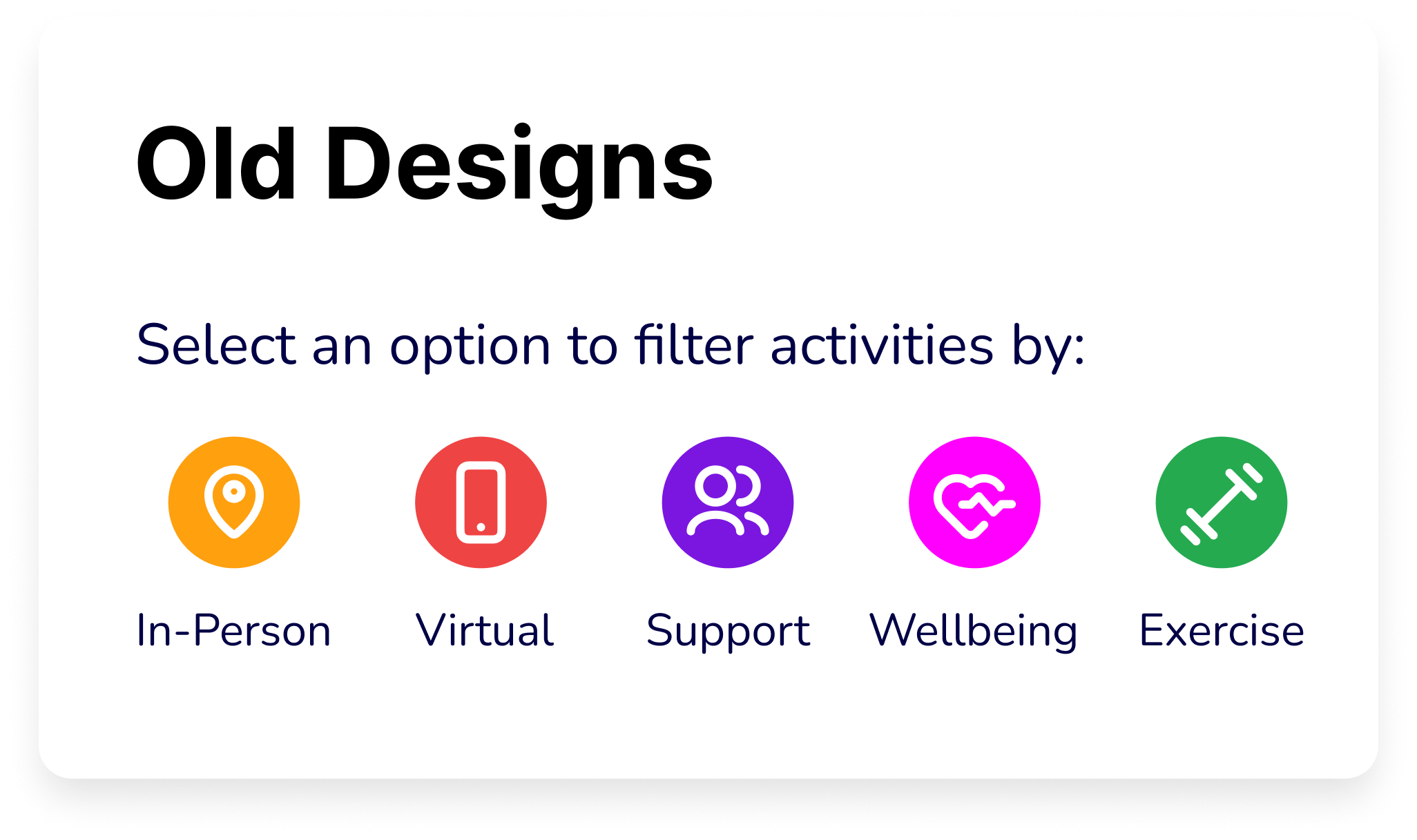
The original design featured a horizontal scrolling carousel, which many users found difficult to navigate.
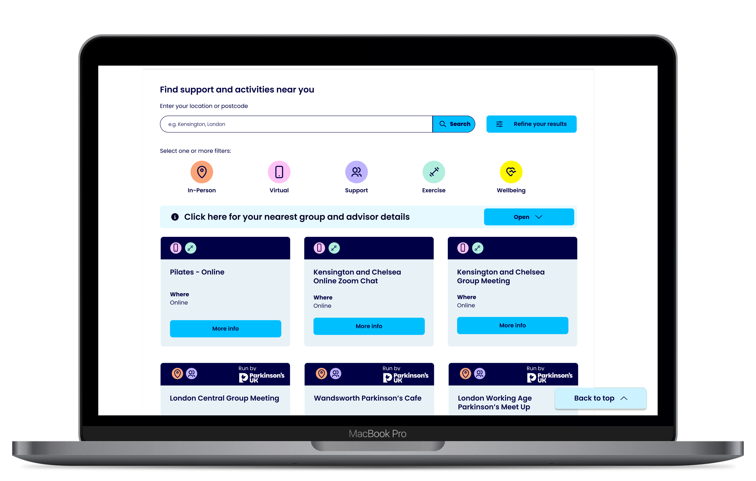
To address this, we came up with these key improvements:
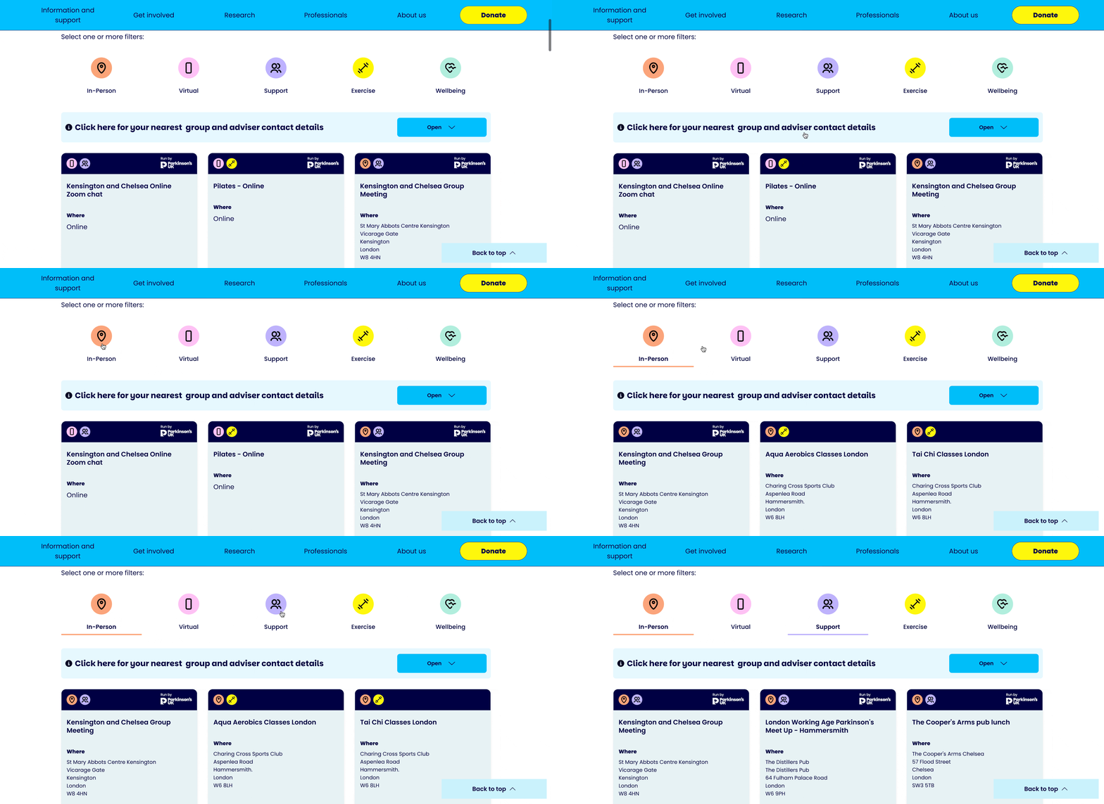
Quick Filters: Determining clear and intuitive labels for users to see the change in results there and then.
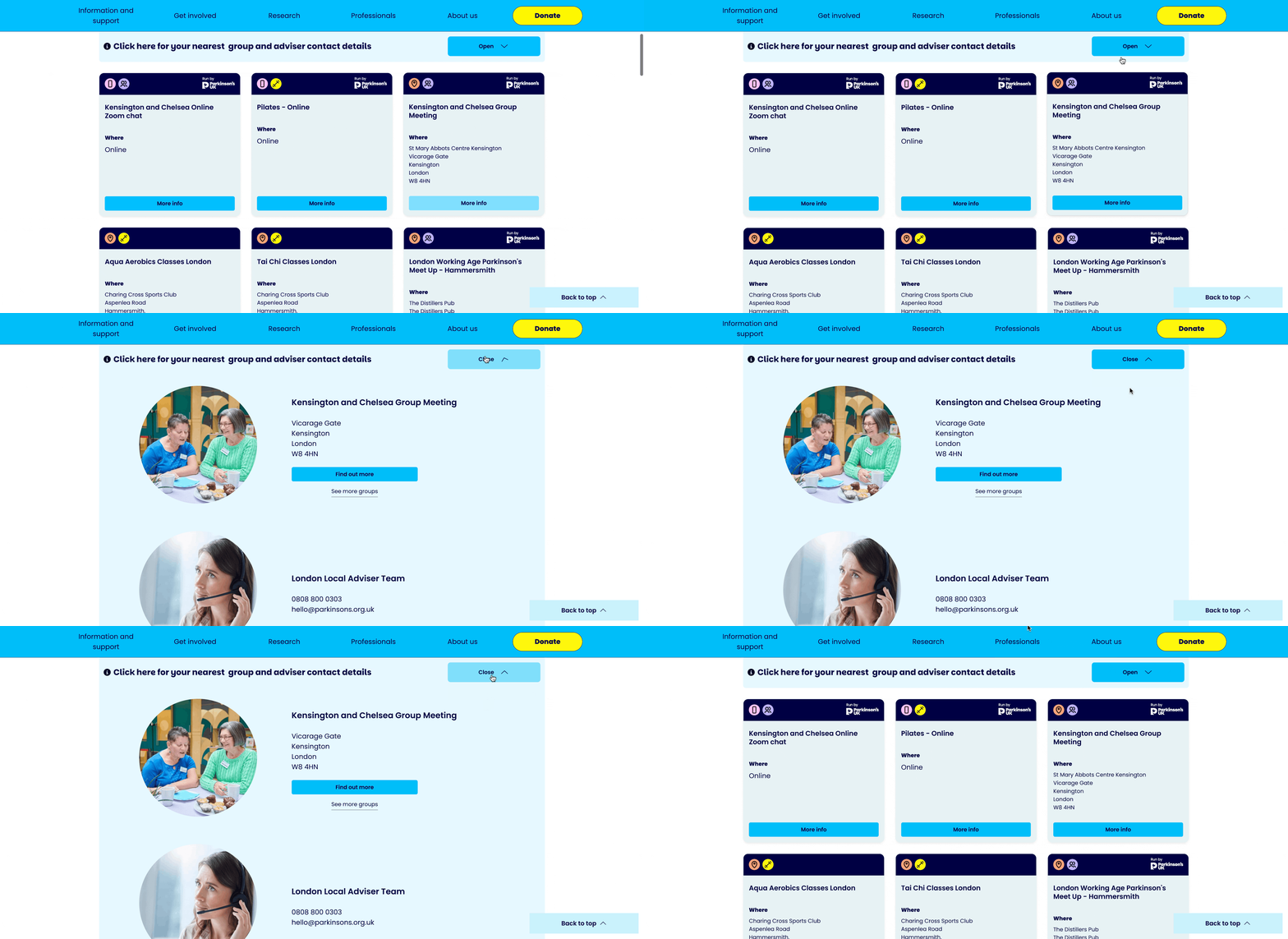
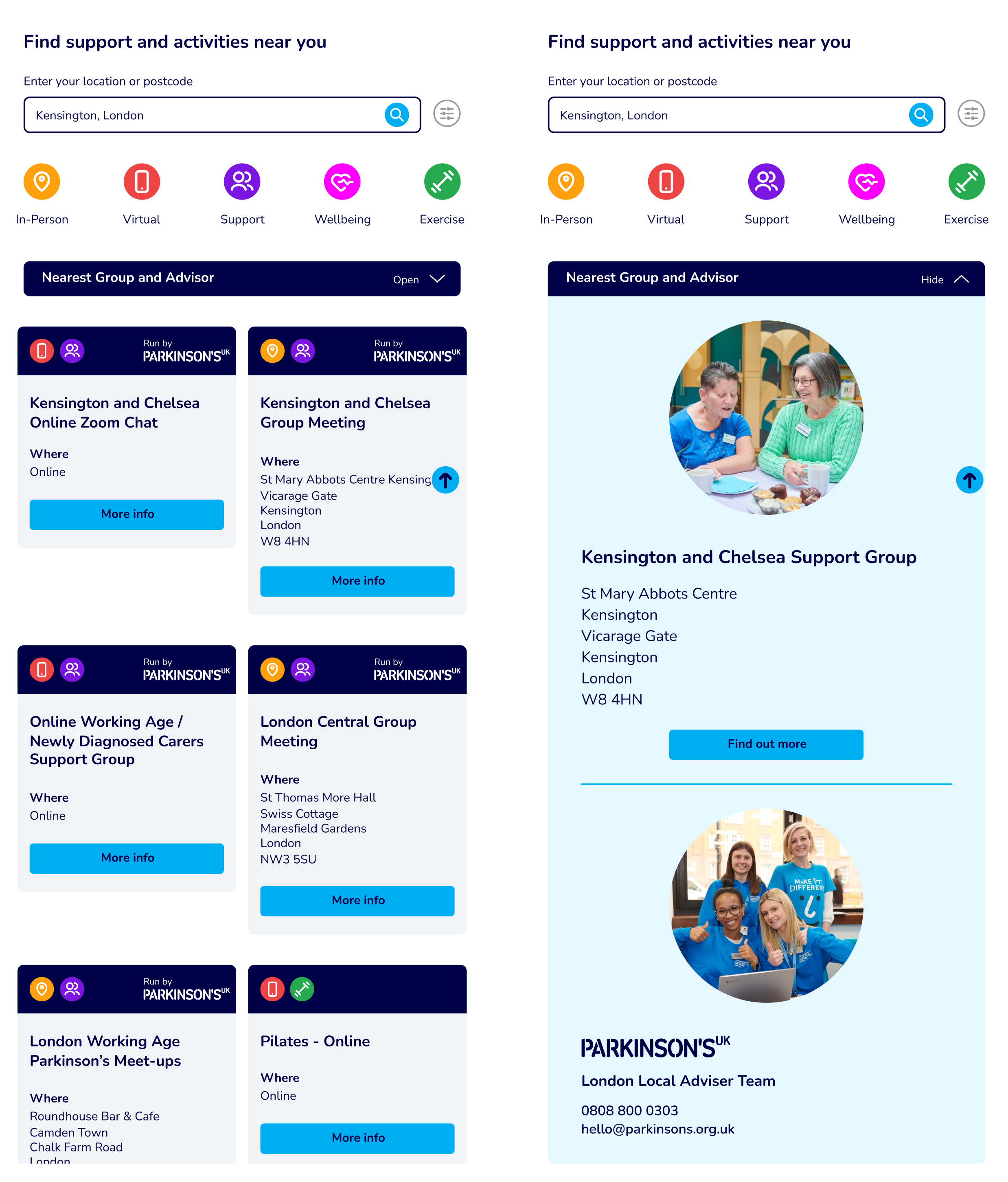
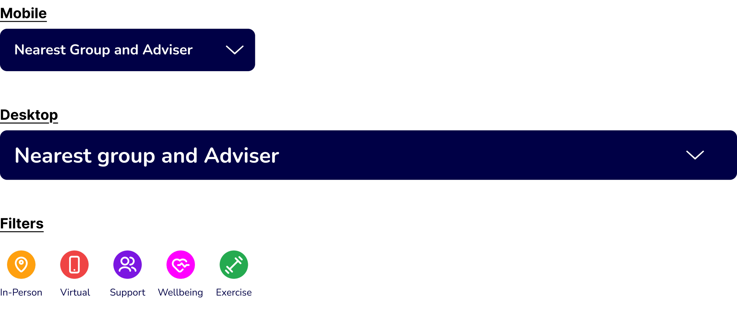
Local Advisers Display: Showcasing the ‘Nearest Group and Adviser’ section with a collapsible option for easier and quicker access.
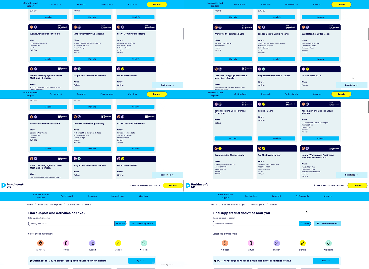
Navigation Improvements: Adding features like a "Back to Top" button to reduce excessive scrolling and improve usability.
The Solution
Gathering Insights 🔍: Conducted user research and collected feedback from local groups to understand pain points and priorities.
Iterative Design ✏️: Created and refined multiple prototypes to test new approaches.
Validation ✅: Ran user testing sessions to ensure the proposed changes improved usability and met user needs.
The Problem
-
📏 Scalability
The system struggles to handle the growing number of activities.
Search results are restricted to the 20 nearest options, reducing its value as offerings expand. -
⚠️ Front-End Limitations
Navigation is unintuitive, making it difficult for users to find relevant activities.
Accessibility is insufficient, leaving some users unable to fully engage with the tool. -
💻 Technical Constraints
Both the back-end and front-end need significant updates to support growth and future integrations with external data feeds.
My Role
I began this project supporting the UX and UI design process, conducting market analysis and contributing to initial wireframes. Midway through, my role shifted significantly when the senior designer left, and I stepped up as project lead 🚀. This involved:
Designing and Iterating 🎨: Taking ownership of the entire design process, from early concepts to final implementation.
Collaborating with Stakeholders 🤝: Working closely with internal teams to ensure alignment on goals and priorities.
Driving Decisions 🧠: Leading the project and making key design choices independently, building both confidence and leadership skills.
Final Design
Before Redesign
After Redesign
Full Case Study (approx 10 minute read)
Discovery
What is the Local Support Tool?
The Local Support Tool is designed to help people with Parkinson’s (PWP) and those affected by Parkinson’s (PaP) connect with local groups. These groups host a variety of activities, from exercise classes like boxing to social gatherings such as pub lunches, providing crucial support and connection for the Parkinson's community.
Understanding our users
The Local Support Tool is one of the most visited features on the Parkinson’s UK website, with a high proportion of desktop and mobile traffic.
From the Hotjar survey, we learned that 50% of our website traffic consists of People with Parkinson’s (PWP) and People affected by People with Parkinson’s (PaP), such as caregivers or family members.
The majority of these users are aged 50 and older, a demographic seeking support that ranges from finding local groups or activities to accessing counselling and emotional support.
However, our data also revealed a significant gap in meeting user needs:
Many users expect the Local Support Tool to connect them with healthcare professionals, but it’s unclear if this is currently being addressed.
The current tool doesn’t differentiate well between types of support, leaving users feeling unsure if they can find what they’re looking for.
By understanding our audience and their expectations, we’ve identified key opportunities to enhance the tool, making it more effective at addressing their needs while delivering an intuitive and supportive experience.
Along with the user research Parkinson’s UK already had, I decided I wanted to conduct my own user research by visiting a local support group, uncovering valuable insights that shaped and refined the designs.
After all, who better to guide the process than the users themselves?
“I scroll down but struggle to go back up again,” suggesting it is difficult to navigate efficiently or locate the necessary controls for returning to the top of the page.
“I find it difficult to scroll down and side to side,” explaining that their shaky hands made these interactions particularly frustrating.
What is the problem and Why redesign the tool?
The Local Support Tool Before Redesign
Define & Develop
As part of the redesign process, I conducted a market analysis to explore how other charities manage their local support tools and to identify features that could inspire improvements for Parkinson’s UK.
One standout competitor was Alzheimer’s Society, which impressed us with its clear step-by-step process for navigating their tool. This approach felt intuitive and user-friendly.
And so let the designing begin...
Creating wireframes to ideate a potential solution.
Airbnb example inspiration
Development: Ideating and testing potential solutions
Next, we created a new round of low-fidelity designs, focusing on streamlined filtering and standardised search data.
Redesign wireframes:
Nunito typeface (pre brand)
Colour Palette & PUK Logo (pre brand)
Approved by stakeholders ✅
〰️
Approved by stakeholders ✅ 〰️
After the stakeholders approved the updated low-fidelity wireframes, we moved on to mid-fidelity designs, focusing on accessibility by incorporating larger clickable areas.
High Fidelity
With the wireframes meeting the required criteria, we moved on to high-fidelity designs.
We knew:
Therefore, we ensured to design responsively for seven breakpoints - 320px, 390px, 640px, 875px, 1100px, 1340px, and 1900px—ensuring the tool was fully responsive and accessible across all devices.
During this phase, there were a few things to think about:
Key improvements
-
🔍 Enhanced event discovery
Removed horizontal scrolling in favour of quick filters and a simplified, user-friendly search results page.
-
📋 Simplified layout
Reorganised content to balance the display of local groups, their activities, and community events.
-
♿ Accessibility upgrades
Added a "Back to Top" button to minimise scrolling and implemented full accessibility compliance to ensure inclusivity for all users.
-
⚙️ New quick filters
Determining clear and intuitive labels allowing users to easily select their preferences and quickly access their desired results.
Final Design
Before Redesign
After Redesign
Mobile
Tablet
Desktop
Designing for mobile, tablet, and desktop during the Local Support Tool redesign required tailoring solutions for each platform, with a heavy focus on mobile due to 60% of users accessing the site on smaller screens:
-
Mobile
⚠️ The main challenge was fitting quick filters on the screen while maintaining accessible tap target sizes. I prioritised content to create a functional, clear layout.
-
Tablet
⚠️ Acting as a bridge between mobile and desktop, tablet designs required decisions on adapting mobile layouts or scaling up, ensuring the experience felt intuitive across orientations.
-
Laptop & Desktop
⚠️ With more space, I introduced richer content and tailored components. For instance, I replaced the mobile-sized back-to-top button with a larger version during the rebrand, addressing concerns that it might be overlooked on desktop.
Testing Feedback
Once the initial designs and prototypes were complete, we conducted usability testing with 25 participants to gather practical, real-time feedback. This process allowed me to refine the design and deliver a more optimal user experience.
User Testing Journey
My project manager and I regularly tested the evolving designs on the test site. It was a lengthy and often frustrating process - fixing one issue would sometimes lead to another breaking. I had to closely monitor the development to ensure it aligned with the design specifications.
Below are a few examples of the types of bugs we encountered and had to raise with the developers:
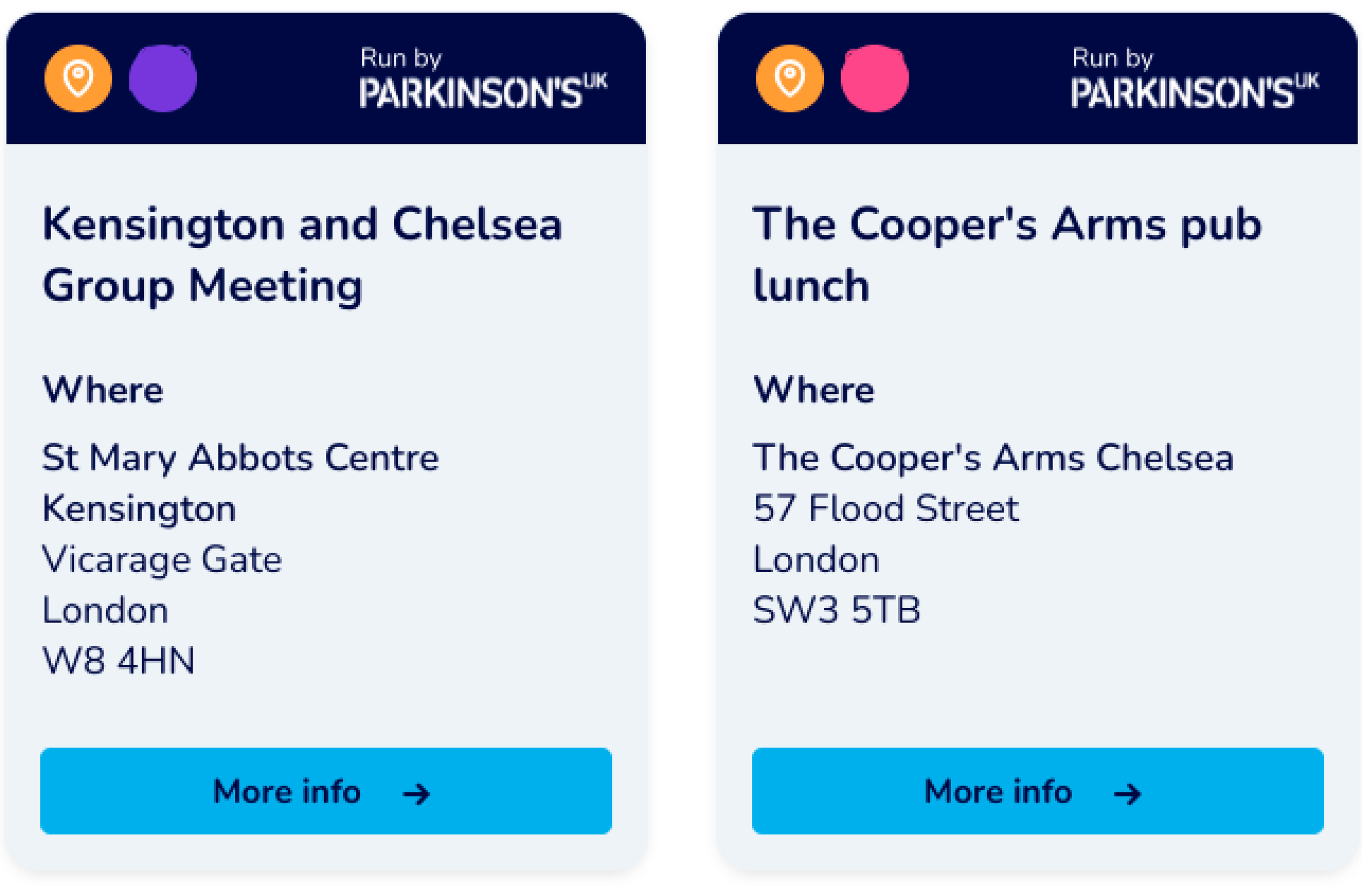
Duplicate icon with different colour code.
Icons hidden behind button.
Alignment issues with the filter and search.
The responsiveness wasn’t quite right; the frame was not aligning properly with the top section as intended.
Labels were incorrectly written & duplicated background colours.
Key learnings from the user testing for iterating
In the usability testing phase of this project, several key insights emerged to refine the user experience.
While participants found the platform generally easy to use, they struggled with certain design and navigation elements.
The "Open for your nearest group and adviser" section was frequently misunderstood, appearing as a static header rather than a clickable action.
Below are the features mentioned in the above feedback.
Design fixes
The feedback inspired me to make significant improvements to the design, and this was the point where I took the lead on the project to drive the iteration process forward.
I transformed the "Show" button into a clearly defined, interactive element that’s much easier to spot and use.
The navy background was replaced with a softer, light blue tone, creating a more inviting and user-friendly visual experience.
Additionally, I added a clear label to the quick filters, to guide users on how to use them.
Rebrand!
Parkinson’s UK was undergoing a rebrand, introducing a new logo, new colours and fonts.
This meant all existing assets and components needed to be updated to align with the new brand guidelines.
It was a great opportunity for me to enhance my Figma skills by tidying up the design files, incorporate autolayout and variables in my designs, and continue iterating to ensure a seamless transition to the new branding.
Rebranded Assets & Design Fixes Round 2
The quick filter design updates include:
🎨 Refreshed colours and fonts
🔲 Bolder labels and strokes
✍️ Clearer descriptions
Quick Filters
Back To Top Buttons
The back to top button has been redesigned as a full-width, fixed button at the bottom of the screen on mobile and tablet, providing a larger, more prominent clickable area. On desktop, it’s now placed in the bottom right-hand corner, making it easier for users to notice and interact with using a cursor or keyboard. This redesign improves usability and accessibility.
It is now fixed at the bottom centre of the screen, making it more visible and easier to use compared to the smaller, less accessible button previously positioned in the bottom-right corner.
Search
The redesign features a sleeker, rounder design with a clearer and more accessible search button that includes the word "search" for easy identification. Additionally, the filter button has been brightened for enhanced visibility.
Back Button
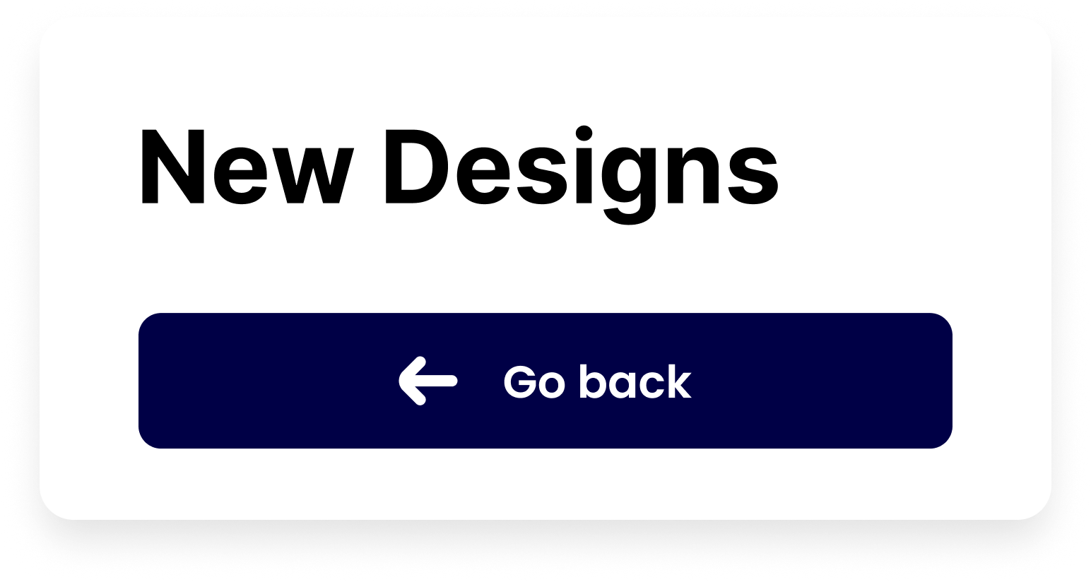
The new design for the 'Back' button features a full-width layout, providing a larger clickable area for ease of use. Additionally, the button is more prominent.
Final Rebrand Designs
Mobile
Screens Displayed: Main Results Page with Quick Filters, Nearest Group & Adviser Open, Filter Section
Tablet
Screens Displayed: Main Results Page with Quick Filters Selected, Showing Results
Laptop
Screens Displayed: Main Results Page with Quick Filters
Desktop
Screens Displayed: Main Results Page with Quick Filters
Video of Mobile Designs
Pages Displayed: Main Results Page, Quick Filters, Filter Options, Activity Cards with details when selected, and the Back to Top Button.
-
Quick Filters:
"Imagine you’re looking for a local support group or an in-person activity. At the top of the page, you’ll see quick filters. I’m selecting ‘In-Person’ first, then ‘Support Groups,’ and the results update instantly. It’s fast and clear, saving you time by showing only the most relevant options."Nearest Group & Adviser Section:
"Next, there’s the 'Nearest Group & Adviser' section. It highlights the closest support group and adviser based on your location. I can tap to expand it for more details or leave it collapsed to focus on other options."Filter Button:
"If you need to refine your search further, you can click this filter button. It opens more options to help you narrow down the results according to your specific needs."Activity Cards:
"The results are displayed as activity cards, showing key details like the date, whether the event is in-person or virtual, and other helpful information. Everything is easy to scan and compare, making it simple to choose the best fit for you."Back to Top Button:
"And if you’ve scrolled through lots of results, the 'Back to Top' button is fixed at the bottom of the screen. It’s always there when you need it, helping you navigate without any hassle."
Key learnings
Redesigning the Local Support Tool for Parkinson’s UK taught me a lot about adapting quickly. When stakeholder feedback didn’t align with the project’s goals, I had to pivot fast, which improved my ability to iterate and make design decisions quickly. With my senior leaving mid-project, I took on more responsibility, working closely with developers and product managers to drive the design forward. I learned how to trust my own user testing data to inform decisions and realised just how crucial testing is—what works for one person might not for another, so ongoing validation is key.
Next steps
Moving forward, I plan to keep refining the tool, focusing on creating a detailed test plan that outlines what we want to evaluate with local support teams. I’ll also focus on identifying any missing KPIs to better measure the tool’s success. With continuous testing and collaboration, I’m excited to further improve the user experience and better support those with Parkinson’s.
Check out my other projects!


