The Pet Stop
User interviews: 5
Usability testing: 5
Methodology: Double Diamond
Skills used: Research, competitive and comparative analysis, low mid and high fidelity design, UI design, prototyping, usability testing, information architecture, card sorting.
Instilling confidence in users purchasing pet products online.
2 Week Sprint. Concept Brief. Solo
Tools used:
Overview
The Client
The Pet Stop, operating since 1993, is a neighbourhood pet supplies shop in Peckham. Their clientele primarily consists of quality-conscious families seeking top-notch products to care for their pets.
The Problem
The Pet Stop faces a challenge with a high number of website visitors but a low conversion rate in completed purchases. My task was to enhance their eCommerce website to display products while preserving their 'small shop' identity and excellent customer service.
Key deliverables include an improved checkout process, product descriptions, live chat, streamlined checkout, access to reviews, and transparent delivery fee display."
My Role
I served as the sole UX/UI designer for this project. My responsibilities included conducting a thorough UX audit and following the double diamond process. I ultimately presented my final design and prototype to both my peers and tutors.
The Solution
User interviews: 6
Design iterations: 2 (based on UI)
Usability tests: 5
The "live chat" feature enhances communication efficiency, replicating the in-store experience online.
The checkout process is streamlined and user-friendly, providing clear confirmation details after purchase.
Access to product reviews allows customers to easily see feedback from other users about a specific product.
Delivery fees are clearly displayed on the product page, enabling customers to view them prior to proceeding to checkout.
The Impact
This was my first full UX project and it was only three weeks into my intensive bootcamp where I had learned so much so fast. From what I learned from this project was that the user should always be at the heart of the design decisions. The deadline for this project was just two weeks, which added to the intensity of the experience. I was so proud to have independently conducted a comprehensive UX audit and then presented my deliverables back to my class. I have two key learnings from this project: trust in the process and embrace growth. Trials and errors are all part and parcel of the UX journey, and that's ok - those errors are the learning curves that will continually hone my skill set throughout my career.
Full Case Study
Client Background
The Pet Stop, operating since 1993, is a neighbourhood pet supplies shop in Peckham. Their clientele primarily consists of quality-conscious families seeking top-notch products to care for their pets.
Brief
The Pet Stop took the initiative to create their own website, but they are dissatisfied with the outcome. Although they have attracted numerous visitors to the site, they have experienced limited success in converting those visits into actual purchases. To address this, they aim to develop an enhanced ecommerce website that effectively showcases their products while preserving their "small shop" charm and commitment to excellent customer service. They emphasise that their utmost priority will always be on maintaining personal, face-to-face interactions with their customers.
Discover
Competitive & Comparative Analysis
During the initial stages of the discovery phase, I undertook a UX audit to analyse a range of competitors and similar businesses in relation to the fictional store (Pet Stop). The primary goal was to identify websites and services that demonstrated effectiveness, which could be used as benchmarks for comparison.
My key findings were:
The three direct competitors displayed features that are all common within a website, however the live chat was not a frequent feature.
Among the indirect competitors, both Amazon and Asos offered all the features. However, it was found through research that Asos lacked a guest checkout option, which proved to be a source of frustration for many users.
Out of all the competitors, only three displayed the live chat feature, while the rest relied on customers calling or emailing their customer service for assistance.
Research Plan
The goals were to:
Discover why users might visit a site, but not complete a purchase.
Determine what constitutes a satisfying online shopping experience for users.
Gain insight into customer preferences regarding customer service.
User Interviews
Once I had my goals and my target audience, I proceeded to conduct six user interviews to gain insights into the challenges and frustrations that users encountered when purchasing pet supplies online. The focus of my research was on pet owners who prioritise high-quality products for their beloved pets.
Affinity Mapping
I used Affinity Mapping to organise my interview insights and recognise patterns in the data. I first identified the checkout process had a substantial number of trends regarding customers abandoning their basket, which followed onto the importance of information products needed in order for customers to feel confident with purchasing online.
Affinity Map
My key findings were:
Users want a fast and clear checkout experience, Apple Pay options and shipping costs displayed before payment.
Users purchasing decisions were impacted based upon reviews and product descriptions.
Users were more likely to shop online if there was efficient customer service.
“If a website offered a live chat feature I am more likely to shop there as it is bringing the in store experience online.”
Throughout the process, I consistently considered, ‘How can I replicate the in-store experience in an online setting?’
“I like to see images, descriptions and reviews when buying for my pet online.”
“I find it frustrating when I am informed of the shipping costs at the last minute.”
From conducting user interviews alongside Affinity Mapping, I concluded that the website should have a way to contact customer service as if customers were in store. By doing this, customers could get the in-store experience online.
Define
Persona
Based on the research findings, a persona was developed to address the key frustrations identified.
Meet Amelia, a 33 year old woman who loves to buy top quality products for her cat. Through my design process, I would refer back to Amelia to ensure I was addressing her goals, needs and frustrations.
Persona
How Might We …
By developing the Persona, I gained a deeper understanding of my users' challenges and pain points. To further guide the ideation process, I created "How Might We" statements. These statements helped me consider different approaches and perspectives to tackle the identified problems effectively. The "How Might We" statements provided a framework for generating innovative ideas and solutions that would address the needs and frustrations of my users. Here were a few:
How might we help Amelia find her product as easily as possible?
How might we improve Amelia’s online experience by providing upfront visibility of shipping costs of the checkout process?
How might we make the checkout process as quick and comfortable as possible?
How might we instil the same level of confidence in Amelia's online purchase as she experiences when shopping in store?
Amelia’s Problem
By analysing the How Might We Statements and understanding the users' key frustrations, I was able to identify the overarching problem. The problem statement revolves around the need for a fast and transparent checkout process, coupled with efficient customer service. The goal is to address these pain points and provide users with a seamless and hassle-free experience during the checkout process, while ensuring prompt and effective customer support.
Amelia requires a fast and seamless online purchasing experience for her pet products, accompanied by reliable customer service and complete transparency regarding any additional charges, so she can shop for her cat with ease.
The Solution
Taking Amelia's persona into account, an idea was developed to enhance the online shopping experience. The concept involved enabling Amelia to engage in online chats with in-store experts, essentially bringing the in-store experience to the virtual platform. This feature would not only provide customers with efficient customer service but also offer them access to additional product information. As a result, customers would feel more confident in making informed and satisfying product purchases. Additional features were:
Implementing a checkout process that displays the shipping cost at the time of checkout.
Providing recommended products to assist users in making informed decisions about their purchases.
Offering fast payment options like Apple Pay for convenient and efficient transactions.
Develop
User flow
I created a user flow that outlines the series of steps a user would go through once they have selected an item, in order to successfully complete the checkout process.
Amelia’s journey, through a user flow diagram
Amelia’s user journey:
Browsers for cat treats
Selects live chat for in store expert
Adds item to basket
Creates an account
Continues through checkout flow
Card sorting
I conducted a card sorting activity with users on Figma to sort products into well-defined categories and subsequently structure the site map accordingly. After completing five rounds of card sorting, I carefully analysed the results to identify common trends and determine the most frequently chosen category placements.
Based on the analysis of the card sorting activity and the identified trends, I was able to determine the seven key categories that would be used for global navigation on the website. These categories were chosen based on their popularity and frequency of selection by users during the card sorting exercise.
Site map
Sketching
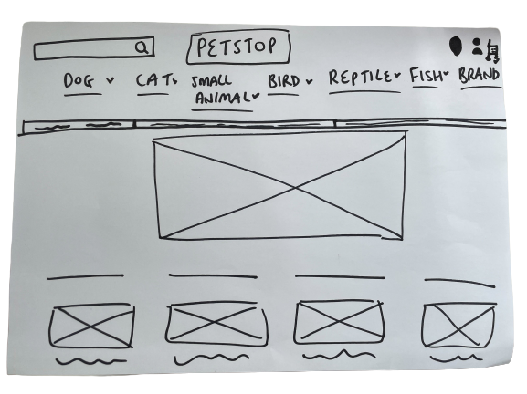
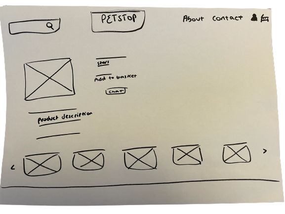
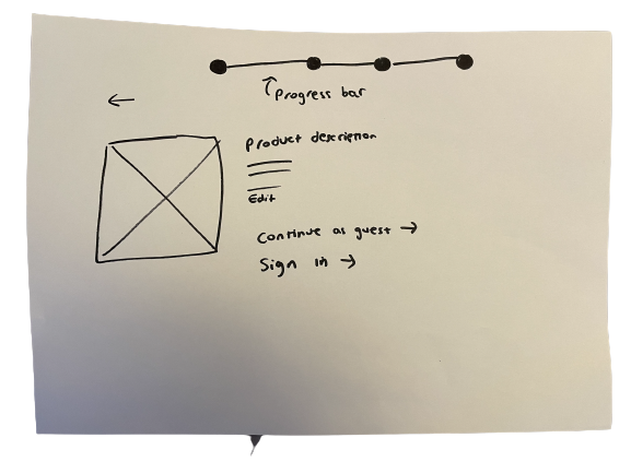
Sketching served as the initial stage of my development process, enabling me to gather visual representations of Amelia's journey across various screens. This early stage helped me gain a deeper understanding of the essential features and make decisions about what to include or exclude when designing. It provided me with a clearer vision of how I wanted the final design to look and feel.
Low-fi wireframes
Mood board
The mood board I created for my high-fidelity design incorporates peach, cream, and white colours. I chose these colours to evoke an atmosphere of luxury and sophistication. I opted for peach to represent elegance and grace, cream to add calmness and balance, and white to bring purity and simplicity to the design. This combination reflects the desired mood of the Pet Stop brand while allowing other elements to stand out effectively.
I have to confess, the mood board underwent numerous alterations and underwent extensive color and image testing to capture the desired brand tone for the website I was designing. I found myself torn between two colours for the CTA (call to action) button, and I ultimately made my decision based on which colour was more attention-grabbing.
Mood board
Mid-fidelity wireframes
Using Figma, I crafted mid-fidelity wireframes and built a prototype, establishing the core design elements for the website.This allowed me to visualise the overall structure and layout. Following this, I conducted usability testing with five participants, assigning them tasks that involved purchasing cat treats, checking product reviews, and engaging with the live chat customer service.
Mid-fi wireframes checkout flow
Prior to conducting the tests, I had certain assumptions and metrics in mind that I aimed to validate. I assumed that:
Users would be able to navigate to the cat treats section within one click.
Users would easily locate the live chat function, find product reviews without any trouble, and complete the entire checkout process within a reasonable timeframe of 10 minutes.
User Testing Results
Through the usability testing process, I was able to gather valuable feedback and insights, which helped validate some of my assumptions while also uncovering areas that required improvement. It provided me with a better understanding of the user experience and highlighted specific areas where I could refine the design to enhance usability and overall satisfaction.
Low-fidelity review section
Based on user feedback, 4 out of 5 users expected to click on reviews and be directed to the review section. To address this, star reviews were incorporated next to each product in the design, ensuring that clicking on the stars seamlessly navigated users to the corresponding review section. Through iterative improvements, this met their anticipated behaviour.
High-fidelity live chat
Additionally, prior to conducting usability testing, users expressed frustration with the checkout process, specifically the lack of visibility regarding shipping costs until the very end. During the testing, all 5 users appreciated the presence of a dedicated section for delivery options and prices. However, they noted that this section could be easily missed and suggested making it more prominent. In response, star descriptions were integrated alongside the reviews on the product page, drawing attention and improving the visibility of the delivery options and prices. These enhancements addressed the users' concerns and improved the overall user experience.
High-fidelity review & delivery section
Users expressed frustration with the chat live feature covering a significant portion of the screen. This limited their ability to exit the chat if they wanted to engage with other features, such as viewing the product description, while on the phone. I made iterative improvements in my final design to address this user feedback.
Mid-fidelity live chat
All 5 users indicated a preference to be reminded of the delivery address once payment has been confirmed. This feature was considered important for user satisfaction.
Mid-fidelity purchase confirmation
High-fidelity purchase confirmation
Deliver
The solution included
The "live chat" feature enhances communication efficiency, replicating the in-store experience online.
The checkout process is streamlined and user-friendly, providing clear confirmation details after purchase.
Access to product reviews allows customers to easily see feedback from other users about a specific product.
Delivery fees are clearly displayed on the product page, enabling customers to view them prior to proceeding to checkout.
How I achieved the brief
I successfully enhanced the online shopping experience for The Pet Stop by conducting a UX audit, competitor analysis, and user interviews. Using the insights gained, I created a persona and addressed the need for a fast and transparent checkout process, along with efficient customer service. Through user flows, card sorting, and usability testing, I optimised the design, including features like live chat, streamlined checkout, access to reviews, and clear display of delivery fees. The final solution ensures a seamless and satisfying experience for customers, fulfilling their pet supply needs with ease.
Key learnings
User research is crucial for identifying pain points and user needs.
Effective communication channels, like live chat, improve customer service.
Transparency in the checkout process builds trust and enhances decision-making.
User testing provides valuable feedback for iterative design improvements.
Visual design influences brand identity and user perception.
Through my UX studies, I've learned that placing a website's logo on the left side is more effective due to content hierarchy, where about 80% of users' initial attention is directed. It's worth noting that, in a specific project, the logo was centred.
Additionally, I gained a deeper understanding of the challenges faced by small businesses and their limitations in providing extensive online customer support. For some small businesses, budget constraints may prevent them from having a large staff to address customer queries promptly. This insight highlighted the importance of developing efficient and accessible communication channels, like the live chat feature, to bridge this gap and provide personalised support to customers. By offering such features, small businesses can enhance their online presence and compete with larger retailers, despite limited resources.
Next steps
Conduct usability testing on the high fidelity prototype to gain insights on areas for improvement.
Assess the feasibility of implementing the "chat with live expert" feature for a small pet shop with limited staff.
Understand the impact of limited resources and staffing on the implementation of interactive features.
Identify additional features or enhancements based on user feedback and testing results.
Check out my other projects!


