Cat Chat
5 Day Sprint. Concept Brief. Solo
Giving a charity website a fresh look, enhancing the UI, to both increase adoption rates and encourage higher donations.
Skills used: Research, competitive and comparative analysis, site audit, low, mid & hi-fidelity design, UI design
Tools used:
Overview
The Client
Cat Chat is a UK-based charity organisation dedicated to the rescue and rehoming of cats across the United Kingdom and Ireland. They specialise in helping cats that are often overlooked for adoption, including older cats, feral cats, and cats with medical conditions. Cat Chat collaborates with rescue shelters and individual fosterers to promote these cats, maintain an online database of cats available for adoption, and actively raise awareness about the benefits of adopting cats through their website and social media platforms. Additionally, they provide support and guidance to rescue shelters and offer educational resources for cat owners and potential adopters.
The Problem
I received a concept brief that challenged me to redesign the homepage, ensuring it's responsive across three different viewports: phone, tablet, and desktop.
This solo project, although fictional, served as a creative exercise aimed at pushing the boundaries of my creativity. The primary goal was to leverage visual techniques to enhance the user interface (UI) of the Cat Chat homepage.
My Role
Unlike our prior projects, which were heavily guided by research-driven design choices, this project was built upon assumptions. Consequently, I found myself responsible for creating my own project brief, describing what I was creating and who my target audience was. While this project was a solo endeavour, I took on the role of a UI designer. Beyond the visual design tasks, my responsibilities included conducting competitor and comparator research, as well as performing a site audit, which involved assessing the homepage, examining the visual design, and evaluating the current branding to inform my design decisions.
The Solution
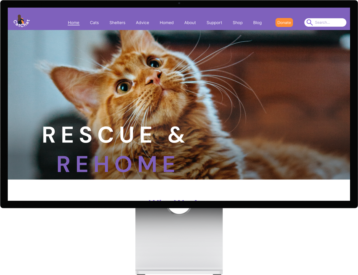
In this project, I conducted a comprehensive redesign of the Cat Shelter Charity website, focusing on both aesthetics and user experience. This overhaul included the creation of a mood board to set the desired brand tone, a carefully selected colour palette to evoke positive emotions, and typography choices that combined modernity and approachability. Notably, the logo was transformed to emphasise the personal connection between humans and cats, symbolising hope and optimism.
Accessibility was a priority in text colour choices to ensure inclusivity. The solution also featured a responsive design, catering to various devices, and optimised layouts that removed clutter and improved content hierarchy. An iterative approach was crucial throughout the project to refine and enhance the design continually. Overall, the goal was to create a visually appealing, user-centric website that effectively conveyed the charity's mission and encouraged engagement from visitors.
The Impact
This UI project was a valuable and challenging learning experience for me, given my limited visual design background. It allowed me to explore various design techniques, resulting in a visually appealing and user-friendly design. Despite the project's challenges, such as relying on assumptions and managing a tight timeframe, it emphasised the importance of research in supporting design choices.
Full Case Study
Brief
I was assigned the task of creating a conceptual brief for the revamp of a homepage, focusing on the charitable organisation known as Cat Chat. This organisation is committed to the welfare of cats by finding them suitable homes and generating funds for their cause.
The project involved producing a redesigned homepage that offers responsiveness across three different viewpoints: phone, tablet, and desktop.
Unlike our prior projects, which were heavily guided by research-driven design choices, this project was built upon assumptions. Consequently, we found ourselves responsible for creating our own project brief, describing what we were creating and who our target audience was for.
Analysis
Current brand & site audit
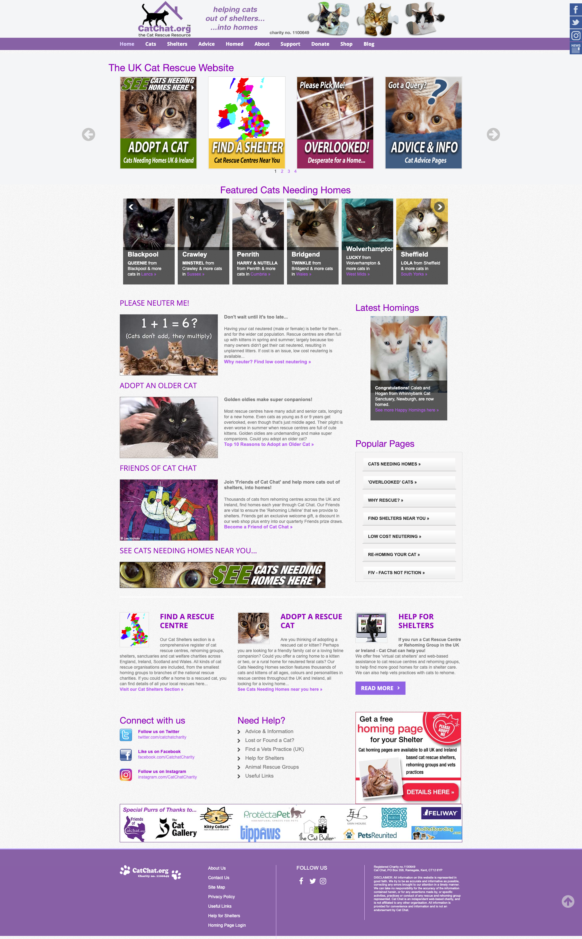
Upon my initial encounter with this website, I recognised significant possibilities for enhancing its impact and user-friendliness.
To initiate my research, I conducted an analysis of the homepage, examining the visual design and the current branding.
Cat Chat, desktop design.
My key findings were:
Missing 'Search' Bar: The absence of a 'search' bar raises questions about its purpose and potential necessity on the homepage.
Monotone Design: The extensive use of purple within the navigation bar results in a visually monotonous and uninspiring aesthetic. Notably, the call-to-action buttons, specifically "Donate" and the absence of a clear "Adopt" button, lack sufficient contrast to distinguish them from the surrounding elements. This blending effect diminishes their capacity to effectively engage users and guide them toward the core purpose of the website.
The content hierarchy is poorly defined, leading to difficulty in identifying essential information. For instance, the “Donate” button becomes lost within the navigation.
The donation form is located on a different page and requires navigating through three pages, but it's not prominently featured on the homepage. This arrangement creates difficulties for users who want to donate promptly and with ease.
Donate CTA not distinguishable from other navigation elements
Timeless but cluttered: While the design exudes a timeless quality, it also suffers from a cluttered layout and information overload.
The homepage is crowded with text and lacks spacing, leading to feelings of overwhelm and uncertainty about where to direct one's attention.
Need for Colour Diversity: The website's colour palette could benefit from diversification to evoke positive emotions, warmth, and hope in users.
Typeface: The choice of typefaces appears inconsistent, and there are instances where text colours are not accessible for everyone.
Purple colour fails accessibility checks
In general, the desktop version of Cat Chat's website entailed substantial scrolling due to its extensive content, resulting in an even longer and more cluttered appearance on the mobile version.
Creating a brief!
Being new to creating my own brief, I believed that the most logical starting point was to consider and define the desired brand tone.
My objective was to design a website that offered a feeling of hope and comfort to individuals making decisions about adopting rescue cats or donating. My intention was to create an atmosphere of trustworthiness, approachability, and compassion throughout the site.
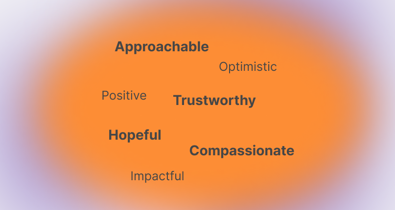
Keywords selected
The brief also prompted me to consider the target audience, the purpose behind the project, and the unique aspects that set Cat Chat apart from competitors.
Brief
Competitive Analysis
I still needed to perform a competitive analysis to evaluate how other charities showcased their achievements and motivated individuals to contribute, all while attracting new visitors. I examined four additional UK-based animal shelters: Battersea Cats & Dogs Home, RSPCA & Cats Protection.
I immediately observed Battersea's primary colours, with a focus on blue. At first, I appreciated the choice of blue for its connotations of trust and reliability. However, as I explored the site further, I realised that there wasn't much that truly captured my attention. The website seemed quite similar to the Blue Cross charity's site.
One positive aspect I found was the site's simplicity, cleanliness, and structured layout, which made navigation easy. The predominant blue colour didn't overwhelm the site; instead, it created a welcoming atmosphere.
Battersea Cats & Dogs Home
Analysing RSPCA's website provided valuable insights into information architecture and effective content placement as well as their prominent CTA stood out to me.
I also liked the convenient and swift donation form right on the homepage as it made donating that one step easier! Additionally, I admired how they integrated statistics showcasing their impact, which infused the site with a sense of hope and optimism.
RSPCA
Among the websites I reviewed, this particular one (Cat Protection) caught my attention. It conveyed a sense of optimism. I appreciated the impactful presence of a large, bold image of a cat right as you land on the page. Additionally, the prominent and distinct Call to Action (CTA) buttons positioned at the top of the page, which remained fixed while scrolling down, were commendable. The layout and navigation were also notably clear and user-friendly.
Cats Protection
Development
Mood Board
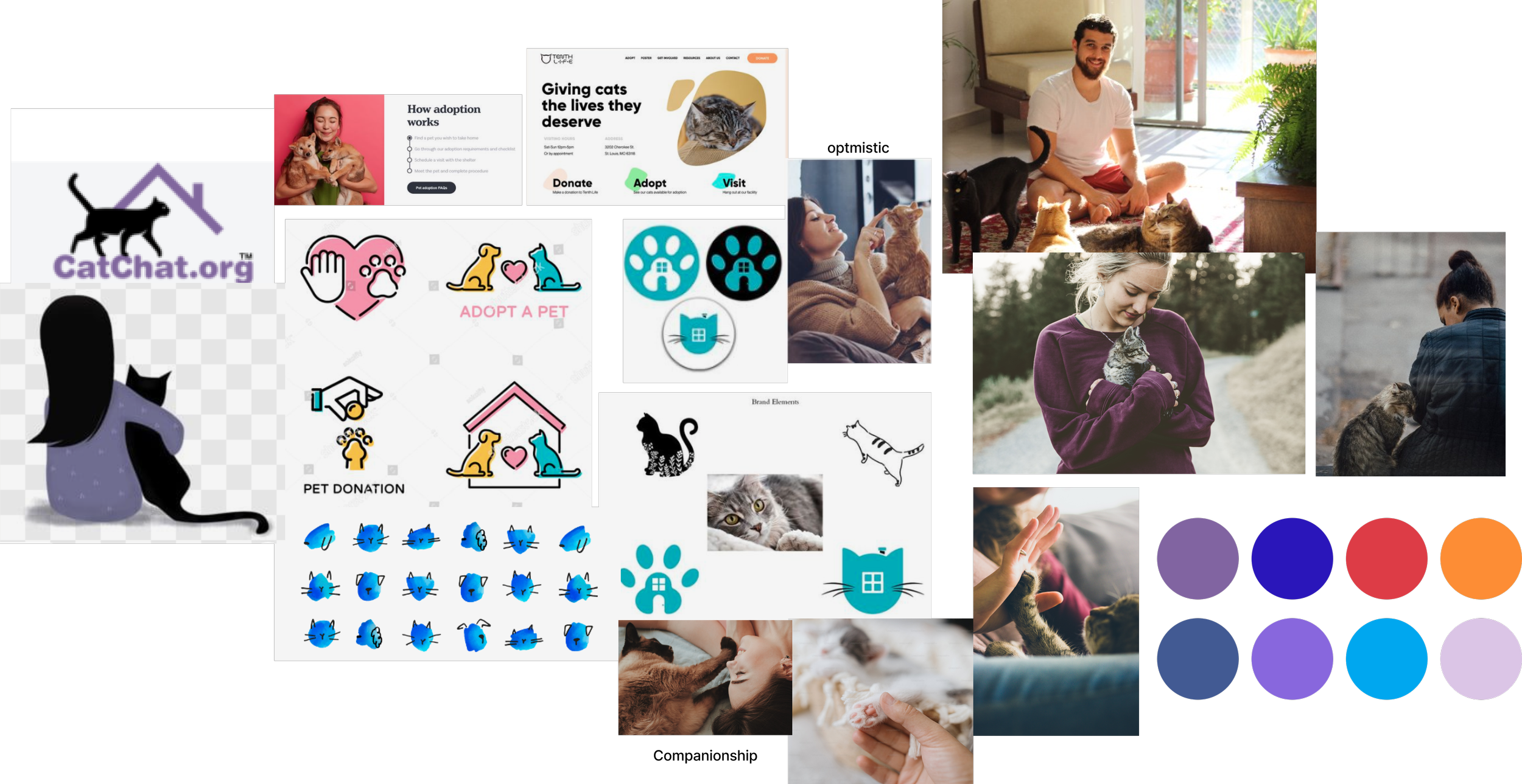
I acknowledge that moodboarding was the most demanding part of the week for me. I realised that there's a genuine skill in choosing images that truly capture the visuals and feelings that I have in mind. But I kept my key words in mind and created this mood board.
I was mindful of maintaining a level of seriousness on the Cat Chat website, similar to other charities, without it feeling too clinical. Striking this balance was important to me. I aimed for Cat Chat to distinguish itself from competitors while maintaining an approachable and friendly atmosphere. To achieve this, I believed that incorporating real-life images as well as maintaining the primary purple colour scheme was crucial.
Brand persona: approachable, optimistic, positive, trustworthy, hopeful, compassionate, impactful
Colour Palette
I understood that my colour choices were vital for the success of my design concept. So, I experimented with different options and learned from what worked best.
While forming the new colour palette, I examined the existing brand colours and studied the primary and secondary colours of the mentioned competitors earlier. This analysis guided my decision on whether to use the main shades of purple or a broader range of colours.
Right from the start, I aimed to include a standout colour for the Call to Action (CTA) button – something the current website lacked but I considered important. Based on competitor research, I found orange to be a suitable choice. It's commonly used for donation buttons, conveying hope and warmth on the screen. Additionally, it pairs well with purple and ensures accessibility.
Typography
For my typography, I aimed for a combination of clean modernity and approachability. I chose DM Sans for headers, which brings sophistication and a modern vibe, adaptable for both formal and friendly tones. For body text, I opted for Inter, known for its balanced design that's clear, modern, and adaptable. This blend conveys professionalism while ensuring information is conveyed effectively in a contemporary and accessible manner.
Logo
As we saw earlier from the review of the current website, the charity's logo appeared quite outdated. What stood out to me was that the logo was the primary branding element present. This sparked my interest in delving into the process of designing a new logo.
Original logo design
Rebranded logo design
I decided to revamp the Cat Chat charity logo, shifting it from the image of a cat walking alongside a house to a depiction of a human alongside a cat. My intention was to create a logo that resonated with people on a relatable and personal level when they visited the website. For me, the essence of animal rescue lies in the connection between humans and animals. What better way to symbolise this bond than by featuring a human and a cat in the logo? The existing logo felt distant and impersonal, lacking the warmth I aimed for. With the new design, I wanted the logo to convey a sense of hope, setting a visual scene for the optimistic future of the partnership between cats and humans.
Delivery
Mid-fidelity Iterations
After finalising the design guide, I transitioned into the Mid-Fidelity phase. With the goal of creating a responsive web design for various devices (phone, tablet, and desktop), I chose to start with a mobile-first approach. This approach enabled me to focus on the core elements of the product initially, providing a strong foundation to build upon in subsequent iterations.
During the Mid-Fi stage, the design underwent significant changes, leading to iterative adjustments in layout and key features in the subsequent Hi-Fi iterations. To address limited scrolling, I removed unnecessary anchor-link tiles and strategically placed the donation form on the homepage for easier access.
As you'll observe, there's a significant transformation from the Mid-Fi designs to the High-Fi versions. This project served as a valuable lesson in the crucial role of iteration and thorough exploration of layouts and information architecture for achieving strong design outcomes.
Moving onto the Hi-Fi…
This stage turned out to be the most time-consuming for me. I underwent numerous iterations, experimenting with various styles of colours, photography, layouts, logos, and donation forms. The examples below showcase just a few of the iterations I explored on my journey to arrive at the final design.
Even though it was time-intensive, I thoroughly enjoyed the experimentation process. It taught me a valuable lesson that having a predefined colour palette doesn't always guarantee the right fit for a design. Sometimes, introducing new colours can quickly reveal whether they align with the intended design ambiance. Additionally, I learned the importance of preserving my iterations, enabling me to compare and determine which options resonated best with the overall vision.
As the iterations progressed, I began to recognise certain features that didn't align well with the overall feel. The "Find Me A Cat To Adopt" form, for instance, bore too much resemblance to the donation form, inadvertently diverting attention from the latter. Additionally, I felt that the swiping navigation for sections was less effective than a straightforward, clear presentation.
Moreover, the images of successfully rehomed cats came across as cluttered and lacking in information. The inclusion of a map at the bottom also didn't offer much value to users. Consequently, I made the decision to embark on a redesign of the homepage's features to address these issues.
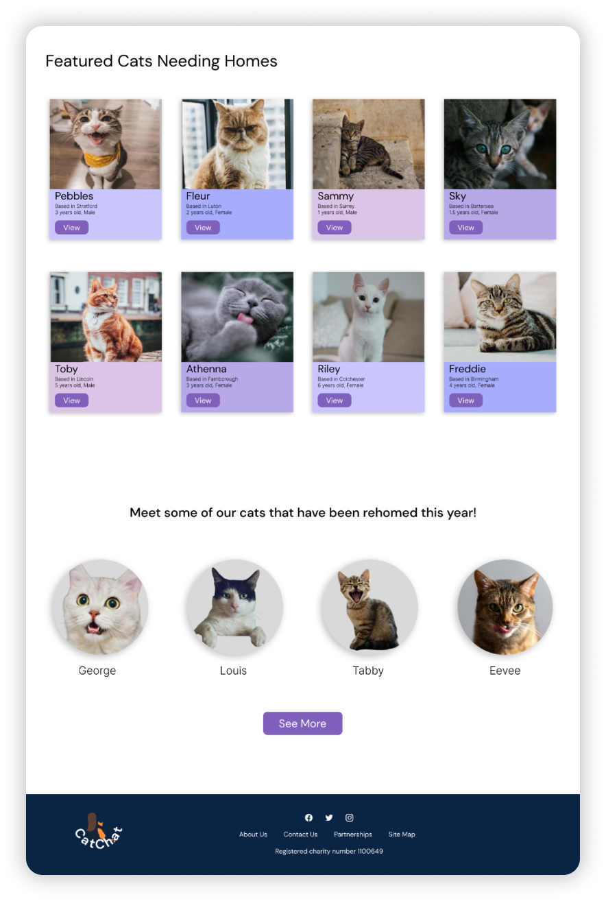
The Redesign…
Mobile
Tablet
Desktop
Style Guide
Towards the project's end, I crafted a style guide, which turned out to be quite significant. This guide would be useful if others joined the project, providing reusable design components, patterns, and guidelines. It's like a toolkit to keep everything consistent and efficient in design work. Interestingly, my style guide underwent quite a journey during this project. It was my chance to experiment with different fonts that could capture the website's intended feel. I also played around with colours, as they evolved along the way.
Grids
Desktop
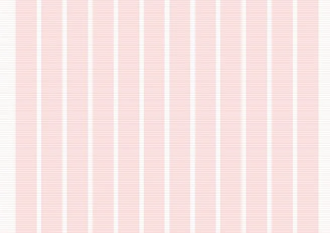
I began by designing the desktop version to ensure the frame's adaptability and scalability. Initially, I created a 12-column layout, allowing the text to expand and contract responsively. I maintained a 70-pixel margin to provide enough space for the oversised text and large fonts, ensuring readability. To uphold a consistent vertical rhythm, I introduced a row section with a height adjustment to 8 pixels, prioritising generous spacing and prominent font sizes.
Tablet
I duplicated the rows and columns from the desktop layout to the tablet and mobile versions, but I adjusted the column count from 12 to 8. This modification allows for additional breathing room and aligns with the specific design requirements for those devices.
Mobile
Furthermore, I adapted the design for mobile by reducing the column count from 8 to 4, better accommodating the smaller screen size while still maintaining responsiveness through stretching. Additionally, I adjusted the margin from 70 to 35, as the reduced space on the sides was more suitable for the mobile layout.
Key learnings
This UI project turned out to be a fantastic learning experience for me. I got to delve into various design techniques that helped me create a design that's not only easy on the eyes but also user-friendly. The tough part was when I had to base my research on assumptions and deal with a short time frame. This project really drove home the point that research is a must to back up and explain our design choices.
A key takeaway from this project is to never delete iterations.They are stepping stones in the design process that allow for quick comparisons and experimentation. All in all, this project taught me that research, keeping things iterative, and being flexible are all key ingredients for successful design.
Check out my other projects!


