3 Week Sprint. Client Brief.
Team of 3.
Explored gamification strategies to enhance user engagement in the In Good Company apps.
My Role: Product Manager
User interviews: 12
Usability testing: 10
Methodology: Double Diamond
My contribution: Competitive research, conducting user interviews, organising and taking the lead in design studio sessions, executing usability tests, Mid-fi wireframes, focusing on creating a gamification feature and rewards section, creating a high-fidelity mobile prototype, and developing the visual design
Tools used:
Overview
The Client
In Good Company, a UK tech-for-good start-up, is dedicated to empowering conscious consumers through an ethical business discovery platform. Similar to TripAdvisor but with a strong ethical focus, their web-app offers curated listings of verified local businesses and experiences that prioritise ethical and social impact values. Currently in a closed beta phase with 400 users, the platform plans to expand beyond London and include one-off events like Farmers Markets and pop-up shops.
The Problem
In Good Company tasked us with the mission of enhancing user engagement through loyalty rewards and gamification. While they already provide sign-up/log-in options, our objective was to further encourage user participation and cultivate repeat visitors who actively engage with the featured businesses.
My Role
In this collaborative project involving two other UX/UI designers, each of us conducted independent user interviews and usability testing, synthesising our findings. I assumed the role of a product manager and facilitator, taking charge of client meetings, project planning, overall decision-making, and the creation of the gamification spinner rewards screen.
The Solution
User interviews: 12
Design iterations: 8
Usability tests:10
Rewards System:
The stamp idea was favoured, aligning with the concept of loyalty cards, familiar to our users.
Users can earn rewards and conveniently track their interactions with different businesses.
Included an onboarding process to ensure user understanding of how the rewards system works.
Impact Tracker:
Research revealed that 100% of users desired to see the impact of their ethical purchases.
Drawing inspiration from tree growth concepts, we delved into gamification and crafted an impact tracker dashboard that connects both personal and community achievements, motivating users to revisit ethical businesses.
Homepage Redesign:
Integrated a sign-in feature for a more personalised user experience.
Incorporated rewards and impact tracking upon user sign-in.
Storytelling:
The main home screen now introduces In Good Company as a business, enhancing user understanding.
Search to Business Listing:
Once logged in, users can seamlessly follow and access business listings.
The Impact
The CEO of In Good Company is integrating my research findings into their funding application, potentially boosting user engagement and loyalty. My user research and beta app testing uncovered valuable insights for immediate UI improvements.
Exciting news: I've been invited to continue working on the gamification and business listings project. Stay tuned for updates!
Full Case Study
The Designers - meet the team!
Katie
Miranda
Anisah
About In Good Company…
In Good Company is a UK tech-for-good start-up on a mission to make it quick and easy for conscious consumers to find the best ethical, for good local small businesses and experiences. Their goal is to grasp what truly connects with users, with the intention of enhancing engagement on a mobile app.
Brief
In Good Company challenged us to:
Loyalty & Gamification: Incorporate rewards and gamification to deepen user engagement.
Boosted Interaction: Drive repeat visits and engagement with listed companies.
Advocate Cultivation: Utilise rewards and gamification to foster loyal advocates, while tracking customer conversion.
Discover
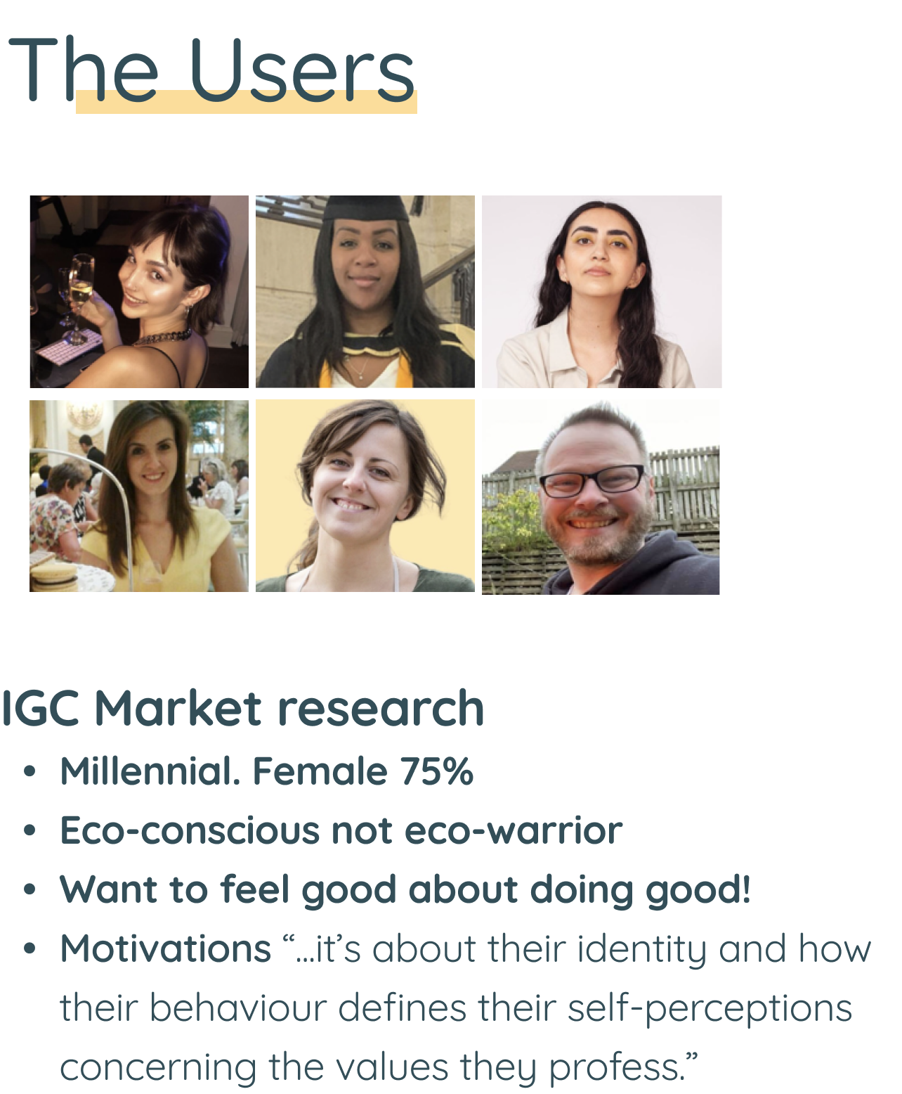
Our design process kicked off with user research, delving into the needs of In Good Company's (IGC) target audience. Thanks to IGC's market research, we were already familiar with their user base - primarily millennials, with around 75% being females. These users are environmentally conscious, without being extreme, and are located in Greater London. While IGC already offers the capability for users to sign up and log in via the web app, our primary emphasis lies in motivating a higher number of users to engage in these actions.
Having a clear grasp of IGC's intended audience, our main goal was to connect with the right people for interviews. We utilised IGC's network, along with our General Assembly and LinkedIn connections, to ensure our outreach matched their desired audience accurately.
Research Goals
With our user base in place, we directed our attention to defining our research goals. We asked ourselves:
How do users interact with the current app - devices used, frequency, login patterns?
Users' expectations regarding account setup.
Online engagement patterns within local communities.
Factors motivating user engagement with apps (writing reviews, likes, shares, comments).
Our Assumptions
User Interviews
IGC already had a beta mobile app in place. Hence, during our interviews with 12 users, we first initially introduced users to the beta app to capture their initial impressions and insights on its potential use. We then followed up with open-ended questions that delved into user habits like logging in, explored their experiences with loyalty programs, and discussed their engagement with local businesses. These conversations aimed to uncover their digital and local preferences, behaviours, and motivations.
After completing user interviews, the task was to consolidate and collect our primary findings. This step was crucial since these insights would serve as the foundation for the entire project. We distilled our findings into an affinity map (see below), which helped us spot trends and patterns in users’ answers.
An overwhelming affinity map - each colour represents a user.
Key findings
We found 4 key insights:
100% of users expressed the desire to immediately grasp the purpose and value of IGC within the app.
1.
“I want to understand the purpose and value of the IGC app right away”
Users are inclined to support ethical businesses and seek to make an impact.
2.
“I find supporting ethical businesses rewarding and want to understand my impact"
Users anticipated additional features when signing up for an account.
3.
“I expect incentives and additional features upon sign-up.”
Users highly value trustworthy reviews and engage online when it's convenient or enjoyable.
4.
“I highly value trustworthy reviews and engage online when it's convenient or enjoyable.”
We found that:
Users wanted to understand the company’s ethical practices and comprehend the impact their purchases have on supporting these businesses.
Users also expressed the desire for incentives to continue using the app when logged in and they expect extra features.
Competitive Analysis
Next, we looked at the user profile, rewards and achievement features for 3 competitors to assess app convenience, usability, on-the-go navigation, planning, and login requirements.
5 elements were of key importance:
On-the-go navigation/plan ahead (Google Maps)
Ubiquity/sale but quality control (Google Maps)
No login required (Google Maps)
User generated reviews (Tripadvisor & Yelp)
Log in for saving/favouriting, bookings and reviews (Tripadvisor & Yelp)
Gamification Exploration
We then felt it was important to explore gamification features to identify potential features to gamify, which in turn, enhances user engagement. We compared 3 apps with gamification. We found that:
Olio lets users earn badges for listing and collecting items, enhancing engagement.
The Tree App goes a step further by visualising daily tree planting efforts on a map.
Tracking impact is central too; Too Good to Go showcases CO2 and money saved, while the Tree App tracks CO2 savings.
Users can self-report goals on progressive causes in Olio, and engagement is tracked through features like TripAdvisor's badges and ranks, as well as social media metrics such as follows, popularity, and likes.
What I learnt from this analysis was that good gamification can be very rewarding, but it only works if you really understand the users motivations. This led us on to understanding our focus. Our focus wasn't solely on boosting app engagement but rather on designing something that aids users in achieving their goals.
Define
Onto the design phase! As we had a lot of insights from our research, we aimed to refine our learning. To achieve this, we created 2 personas to help visualise our user’s challenges and think of them differently.
Persona
First, we created a primary persona. Meet Molly, a 37-year-old who currently struggles with the challenge of juggling her commitment to ethical businesses with the demands of her hectic work life.
Developing Molly's persona proved invaluable in identifying her essential needs and frustrations, guiding our design choices. Nonetheless, due to diverse user insights, we introduced a secondary persona, Michelle, a 28-year-old who occasionally places convenience and unique experiences ahead of ethical considerations.
We developed two user personas, Molly and Michelle, to keep our design process user-centred and adaptable. This dual persona approach ensured that our design decisions considered both strong commitment to ethics, represented by Molly, and occasional prioritisation of convenience and unique experiences, represented by Michelle. These personas served as a constant reference point throughout our design journey, enabling us to create a more inclusive and effective user experience.
Problem Statement
Considering the needs and challenges of Molly and Michelle, we formulated a problem statement to provide a structured understanding of the issue:
Users need a convenient, enjoyable platform that effortlessly instills trust and confidence, so that it is easy for them to stay motivated and engaged in supporting local ethical businesses.
The problem statement defines the user’s main need and the goals for our project.
The Overlap : Business goals + User goals + Values
Balancing the needs of the business and users is integral to a positive user experience. IGC holds its values in high regard, making ethical businesses a crucial component in this equation.
Development: Ideating and testing potential solutions
Stepping into the Develop phase, this is when I took the lead. My objective was to generate solutions for the identified problem. This was achieved through a collaborative brainstorming session in the design studio, with a specific focus on rewards, impact, gamification, and the community feature. I allocated 15 minutes for each topic and then reviewed everyone's designs.
I centred the design studio around 3 How Might We statements and asked everyone to sketch possible solutions.
I ran the design studio with our client and her team via Google Meet & Figma.
To foster creativity, I opted for bold and broad statements to allow for a wide range of diverse answers. The solutions I generated included:
How might we incentivise users to transition from opting for chains to actively choosing local businesses without sacrificing convenience?
2. How might we transparently display ethical practices and impact to boost user confidence?
3. How might we ensure sustained and simplified engagement and motivation in supporting ethical businesses on the platform?
I thoroughly enjoyed leading this workshop, as I find it exciting to inspire and educate groups about design processes. The development team shared their enthusiasm for their involvement in this design process, as it provided them with a firsthand perspective on how designs come to life.
Feature Prioritisation
Given the number of ideas generated during the design studio session, we employed a feature prioritisation approach. This involved classifying features into categories based on feasibility and priority. This allowed us to discern which features held the greatest potential for impact and success within the project. Our research indicated that both the rewards system and impact tracker emerged as fundamental solutions.
Wireframes
Rewards system
During the design studio session, one standout idea was the rewards stamp card, which we recognised as an excellent means to boost user engagement and promote app continuity. Additionally, it offered an effective method for tracking user interactions, enabling us to demonstrate the impact of their visits to ethical businesses. We favoured the stamp idea because it tracks user behaviour and aligns with the familiar concept of loyalty cards, something our users frequently utilise.
Rewards process: Sketch to mid-fidelity wireframes.
Impact tracker
Our research confirmed that 100% of users wanted to see the impact of their ethical purchases. We explored gamification, inspired by tree growth ideas from the design studio. We liked the concept of users visualising their impact but were uncertain about its simplicity and how it should be tied to community or in-store efforts.
Usability Testing
We initiated our design process by focusing on the navigation bar to establish the sections we intended to incorporate. Initially, we utilised UI elements from the navigation bar design provided by In Good Company. However, we made adjustments based on the results of mid-fidelity testing.
I iterated on the navigation bar to simplify it and make it less overwhelming for users.
100% of users liked the new feature of rewards and impact.
Additionally, I introduced the two extra sections, ‘rewards’ and ‘impact’, based on our research findings, believing they would be beneficial to users.
Rewards section
Users weren’t sure where or how to access rewards.
Users were confused about the duplicated sections.
Onboarding for the rewards section was also too long.
Impact section
Users expressed a need for a simpler way to track their actions and understand their impact.
Users felt a lack of connection to the business, finding the existing information vague and not tailored to their needs.
They expressed a desire to see the community impact, indicating that this feature would encourage them to return to the app.
Impact process: sketch to mid-fidelity wireframes.
UX writing
We found that:
While our formal usability testing was focused on mid-fidelity, we conducted an additional test on the beta app to gather qualitative data about user thoughts, desires, and expectations. We uncovered more insights than we originally anticipated, especially regarding navigation and accessibility aspects, significantly influencing the development of our high-fidelity designs.
Define
High Fidelity
Following the usability tests and our research, we began developing the high-fidelity prototype with the aim of integrating our new rewards and impact features into the native app. Initial user feedback highlighted navigation and social aspects. Some users found the social aspect appealing for discovering new places through trustworthy reviews, while others felt it needed a more gradual introduction instead of being the initial homepage focus.
Final design: integrating rewards and impact features
The impact prototype underwent a significant transformation from mid-fidelity to high fidelity.
We simplified it to gamify in-app engagement, such as sharing, reviewing, and inviting friends, all contributing to tree planting. This approach aligns with our persona's desire for simple actions with community and environmental impact, allowing users to work collectively toward planting trees.
The high-fidelity navigation bar had a 100% success rate with users navigating throughout the app. From the testing on the mid-fidelity, where users found the navigation bar to be too overwhelming, I created this new navigation bar to introduce simplicity and alleviate the overwhelming experience throughout the app.
Style Guide
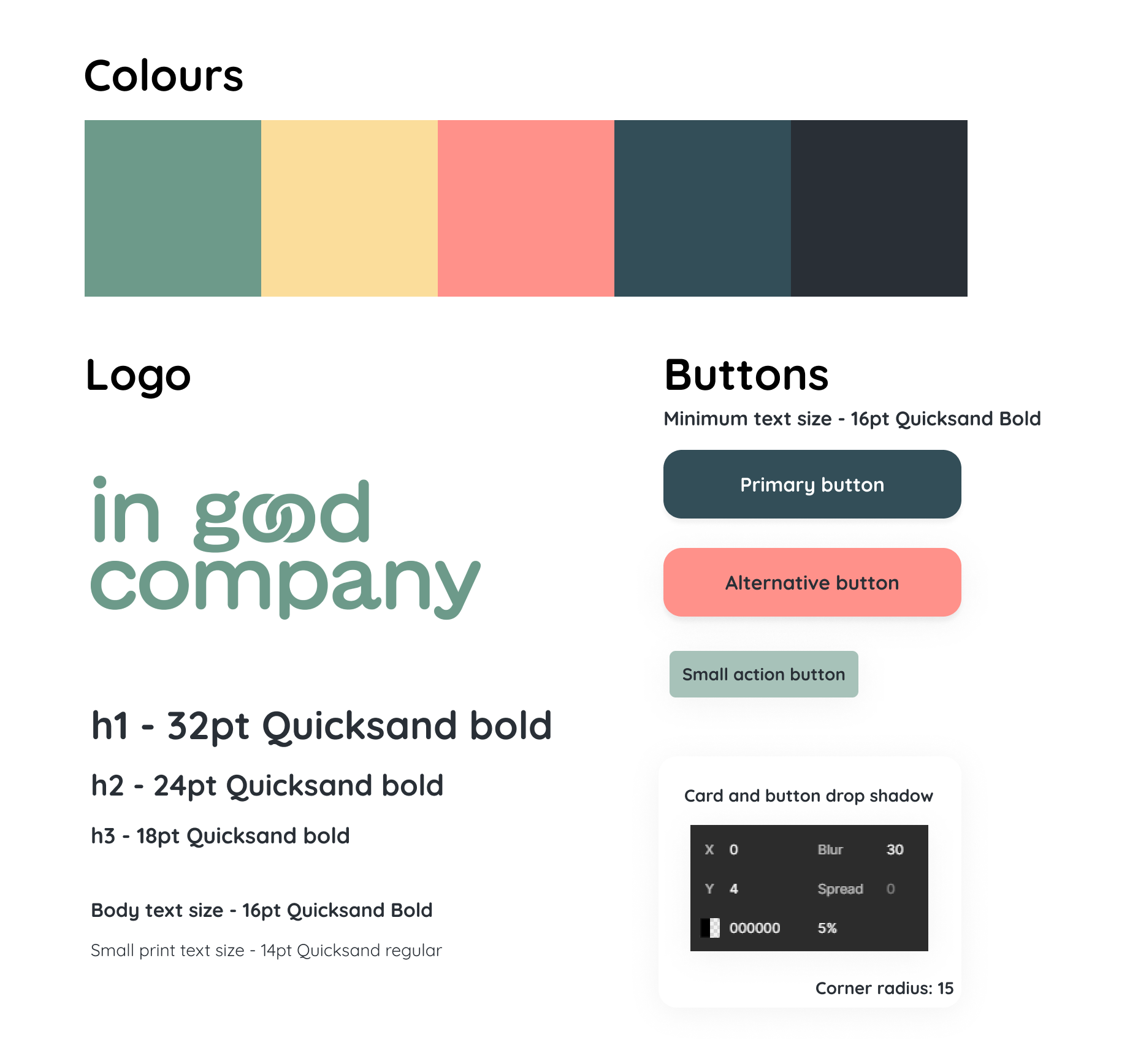
Initially, we received excellent feedback on our style guide, with users loving the warm, inviting colour scheme that conveyed empathy. However, we idenitified some accessibility issues, notably with white text on a pink background. To address this concern, we recommended using a darker text colour and a slightly bolder typeface, especially on the pink buttons, to enhance contrast and improve accessibility.
The feedback provided on the beta app proved immediately valuable to the client, enabling us to identify and prioritise a series of quick UI enhancements that could be implemented promptly to improve the user experience.
Style Guide
Reviewing accessibility: Passed with increased contrast & Quicksand bold
Deliver
The final design included:
Homepage Redesign: I integrated a sign-in feature for a more personalised user experience, incorporating rewards and impact tracking once users sign in.
Storytelling: The main home screen now features an introduction to In Good Company (IGC) as a business, enhancing user understanding.
Search to Business Listing: Once logged in, users can follow and access business listings seamlessly.
Impact Dashboard: Based on user feedback, I implemented an impact dashboard that allows users to track their individual impact and the community's overall impact.
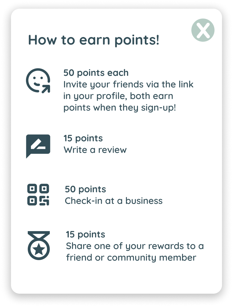
Rewards Dashboard: Users can earn rewards and conveniently track their interactions with different businesses.
Rewards Onboarding: To ensure user understanding, we included an onboarding process explaining how the rewards system works.
Key Learnings
My key takeaways from this project are:
User-Centric Validation: This project reaffirmed the importance of involving users early and often. Instead of time spent over indecisive functionality choices, I've learned to consult users sooner to validate ideas, ensuring designs align with their preferences.
Flexibility and Adaptation: I've come to understand that the initial idea may not always be the best one. This project taught me to remain flexible and empowered me to explore alternative solutions when the first idea doesn't meet user needs effectively.
Effective Collaboration: Being open to input from team members, stakeholders, and clients has enriched our design choices by incorporating diverse perspectives, resulting in more well-rounded solutions.
Next steps
The CEO of In Good Company is currently integrating my research findings into their funding application. If successful, my research and design work will play a pivotal role in enhancing user engagement and attracting a more loyal customer base for IGC. I also uncovered further feedback and insights from our user research and beta app testing that proved immediately valuable to the client. This information served as the foundation for a set of rapid UI improvements that they can implement without delay.
I'm thrilled to announce that I've received an invitation to continue my work on the gamification and business listings project. Stay tuned for more updates!
Check out my other projects!


